Colors matter.
A lot.
We have a mortgage client that was running a PPC campaign to a lead funnel we developed for him.
Tens of thousands of clicks per month at $12/click.
The landing page we built for the campaign had a big, fat, orange CTA button.
Conversion rates on that thing were 17%+.
It was marvelous.
His internal design team saw the page & scoffed, “You need to make that button green!”
Their brand was green.
They wanted the button to be the same color green as the rest of the design details on the page.
We tried to explain the logic behind the colors, & suggested instead trying yellow, or bright blue, or something else that would have a stark contrast from the rest of the page.
They weren’t having it.
Finally, we suggested using a tool called Optimizely to let data drive the decision.
Optimizely would split the traffic 50/50 in real-time to see what kind of difference the orange button made vs. the on-brand option.
So we turned on the test & let the variations get 1K visitors each.
The results were clear:
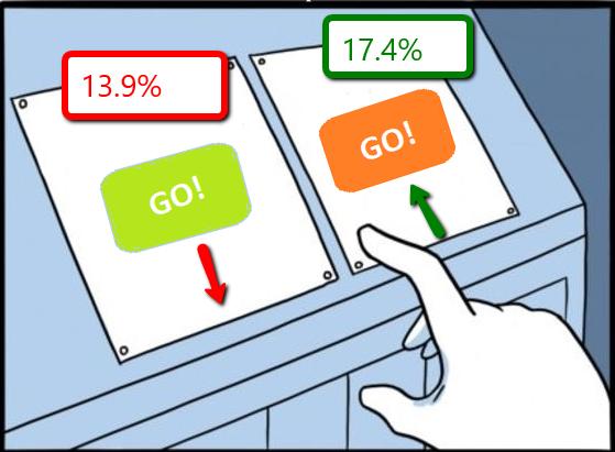
Orange button: 17.4% conversion rate
Green, on-brand button: 13.9%
That’s a 3.5% difference.
350 leads for every 10K visitors.
That green button would’ve lost them a LOT of business had it stayed.
That sucker was GONE.
-Andrew Pawlak
#TakeBackYourLeads
Learn More:


